
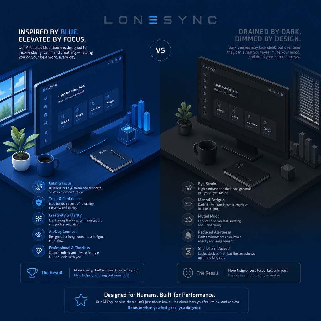
LoneSync’s Blue Theme is created to inspire clarity, calm, and sustain focus. Dark Theme prioritizes sleek aesthetics but can carry hidden costs over time.
Why color and theme choice matters:
Color and contrast influence not just how an interface looks, but how people feel, think, and perform while using it. Theme choices affect eye comfort, cognitive load, mood, and long-term engagement—factors that matter for productivity apps, dashboard tools, and any environment where users spend extended periods.
Benefits of the LoneSync Blue Theme
*Calm & Focus: Blue reduces eye strain and supports sustained concentration, helping users stay on task longer with less fatigue.
*Trust & Confidence: Blue conveys reliability and clarity, reinforcing feelings of security and professionalism in the product.
*Creativity & Clarity: The theme supports clear thinking, communication, and problem-solving by providing a pleasant, consistent visual environment.
*All-Day Comfort: Designed for long sessions, the palette reduces visual fatigue so users can maintain performance throughout the day.
*Professional & Timeless: The blue aesthetic is modern but enduring, aligning with enterprise and creative contexts without feeling dated.
Practical outcomes (Blue Theme):
*More energy and better focus for users.
*Greater impact: clearer interfaces help users do their best work.
*Emotional uplift: a design that feels calm and reliable can improve confidence and collaboration.
Drawbacks and trade-offs of the Dark Theme
*Eye Strain: High contrast on dark backgrounds can tire eyes faster for some users, especially in varied lighting conditions.
*Mental Fatigue: Over time, muted and low-contrast UIs may increase cognitive load rather than reduce it.
*Muted Mood: A lack of color can feel isolating or uninspiring, which may dampen creativity and motivation.
*Reduced Alertness: Dark environments can lower energy and engagement, potentially affecting productivity in long sessions.
*Short-Term Appeal: While dark themes can look sleek initially, the long-term user impact—fatigue and lower focus—can outweigh the immediate aesthetic benefit.
Practical outcomes (Dark Theme):
*May feel stylish at first but can lead to more fatigue, less focus, and lower sustained impact over time.
LoneSync’s Blue Theme is designed not just for visual appeal, but for sustained inspiration—promoting focus, comfort, and confidence. Dark themes can be visually striking, but they carry risks that may erode productivity and well-being over time.